
What is CredTech ?
by Rory Traynor
The role of data is to empower decision making, but even the most accurate data set is useless if its insights are not easily and quickly discernable. As data becomes increasingly available to businesses, so to does the size and complexity of the datasets delivered to decision makers.
For effective decision making it is paramount that these complex datasets are transformed into clear, actionable insights. As companies navigate through extensive datasets to make informed decisions, traditional reporting methods often fall short of effectively conveying key messages to stakeholders.
Enter the visual power of data: Red Flag Alert’s infographics and data visualisation tools transform the way businesses report and communicate their findings by turning complex datasets into clear and concise graphs and infographics.
Business reporting is an essential practice, but statistics can quickly become overwhelming and confusing, diluting their impact. As data's complexity rises so to does the need to employ specialist staff who are able to analyse it and turn it into actionable information.
Hiring these staff is expensive, with salaries for senior data analysts reaching over £60,000 for UK businesses. This means that SMEs and organisations on stricter budgets can be left unable to effectively use data and compete with those companies that do.
Even for well funded enterprises, the need for collected data to pass through a specialist team creates a bottleneck and means that most areas of the business are essentially unable to access the benefits of data.
At Red Flag Alert, we understand the transformative effect widespread access to data has and believe that to be truly competitive in the modern economy, that decisions on all levels at a company should be based on guess work but rather the most up to date information available. For this to be possible, data needs to be quickly understandable without any specialist training required. That is why we created and implemented transformative infographics and data visualisation into our comprehensive data platform.
From enhancing clarity and accessibility to fostering engagement and driving strategic decision-making, these visual tools are revolutionising the way businesses consume and analyse data.
Explore the myriad of ways in which Red Flag Alert’s infographics and data visualisation are reshaping business reporting practices and empowering organisations to unlock the full potential of their data.
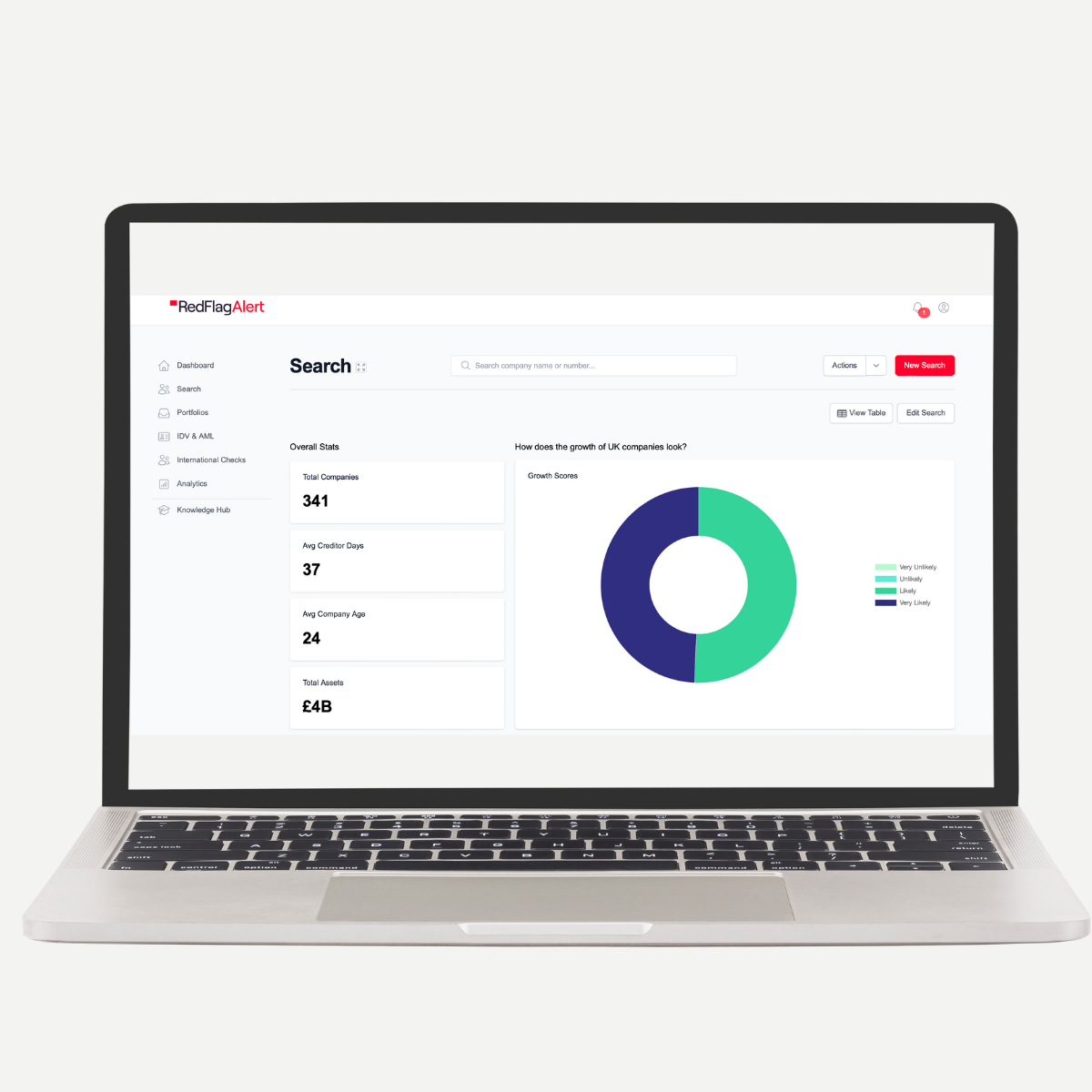
Red Flag Alert's portfolio monitoring tool utilises infographics to support data interpretation by transforming complex financial and business data into visually digestible formats. Instead of being faced with convoluted and cramped datasets, a clean and tidy dashboard is presented to users.
Providing a clear snapshot into key metrics and relevant updates, users can instantly access insights at a glance, and assess their portfolio’s performance and risk profile.
By condensing key metrics such as revenue growth, profitability, and financial health into visually appealing charts or graphics, the overall health of portfolios is immediately available, removing the need to sift through extensive numerical data.
Infographics are integrated into Red Flag Alert’s interactive dashboards that allow users to customise their data views, filter information based on specific criteria, and drill down into detailed analytics.
By providing users with interactive visualisation tools, Red Flag Alert's portfolio tool empowers users to explore data in a more intuitive and personalised manner, facilitating deeper insights and informed decision-making.
.png?width=593&height=306&name=image%20(2).png)
.png?width=639&height=264&name=image%20(1).png)
Red Flag users don’t just enjoy accessible data visualisations, they can see and feel their impact every day, across the following benefits:
Risk Identification
Identifying potential red flags or areas of concern within portfolios is instant with dashboards highlighting anomalies or deviations from established benchmarks. Followed by visual representations of risk indicators, such as company credit scores, payment behaviour, and financial ratios, users can pinpoint high-risk entities or sectors that require closer scrutiny or action.
Trend Analysis
Trend analysis is visualised across historical data and performance trends over time. By presenting data in interactive charts, graphs, or timelines, users can track changes in key metrics, identify emerging patterns or trends, and gain insights into the underlying drivers of portfolio performance.
Comparative Analysis
Comparing and establishing benchmark entities such as market share, growth rates, or financial ratios against industry peers and predefined criteria gives users the power to act on the data. Red Flag Users will only need one minute to identify outliers, assess relative performance, and make data-driven decisions about resource allocation or investment strategies.
Geospatial Visualisation
Infographics can leverage geospatial visualisation techniques to provide users with insights into the geographical distribution and concentration of their portfolio holdings. By mapping out the location of entities or assets within their portfolio, users can identify regional trends, assess geographic risk exposures, and optimise their geographic footprint or market expansion strategies.
Traditional business reports often inundate stakeholders with dense blocks of text and numerical data, making comprehension challenging and inefficient.
Infographics and data visualisations transform these into clear, concise and actionable insights. Utilising charts, graphs, and diagrams, businesses articulate key messages with clarity and brevity, facilitating comprehension and accessibility.
Red Flag Alert’s powerful solutions also reinforce narratives, giving businesses the chance to weave complex data insights into reports with visual highlights, amplifying storytelling capabilities to improve engagement.
Well-crafted infographics and data visualisations also bolster brand-building endeavours. By showcasing expertise, innovation, and a steadfast commitment to transparency, businesses distinguish themselves amidst competition, fostering credibility and fortifying their brand image.
Users can also share complex reports and data with the use of infographics and interactive visualisations to create dynamic experiences, fostering deeper engagement with stakeholders and wider audiences, and boosting brand awareness and authority.
Red Flag Alert’s industry-leading methods of presenting complex data in a digestible way serve as an invaluable aid in any decision-making process.
The portfolio tool within the platform can be utilised by anyone at any skill level by presenting them with instant data interpretations across trends, patterns, and insights from extensive datasets.
By presenting data visually, businesses facilitate more informed decision-making, empowering stakeholders to identify opportunities and risks effectively.
Moreover, these infographics and data visualisations are dynamically updated in real-time to reflect the latest insights from the original dataset, enabling anyone in any business to provide stakeholders with current information and respond promptly to market fluctuations.
Our aim is to equip every business with the tools they need to instantly gauge the financial health of their portfolios, alongside comparative data to measure the business’ performance against industry standards, competitors or historical trends.
It’s through these tools that organisations can spot opportunities sooner, noting benchmarks and performance metrics that open up avenues for improvement.
Strategic approaches are also supported by the addition of visualisation tools and infographics - an element that hasn’t been overlooked by Red Flag Alert.
We have curated advanced data visualisation techniques, including predictive analytics and forecasting models to empower businesses to anticipate future trends and outcomes. By visualising predictive insights, organisations can make informed strategic decisions in seconds, proactively addressing challenges and seizing opportunities before competitors.
Incorporating these benefits, infographics and data visualisations create accessible versions of traditional credit reports.
In turn, they become indispensable tools for sales and marketing understanding, crafting marketing collateral, simplifying client explanations for sales teams and account managers, streamlining strategy planning with key information, and offering insights that might otherwise be overlooked.
What sets us apart is our expertise in business risk and opportunity paired with our understanding of how businesses use data and how they could use it more effectively. These have led us to create the most accurate algorithm, with a 92% accuracy rating, and a platform that has been specifically designed to meet the needs of and empower modern businesses. Featuring:
Optimise your business data now and unlock the door on its potential with Red Flag Alert, get your free trial today.
Stay informed
Sign up to receive expert insights direct to your inbox.